I created this code in order to do a visualization of natural hazards globally, to use as a graphic for a new initiative at Stanford on “urban resilience.” You can check out the group here: http://urbanresilience.stanford.edu/
It is quite simple, and demonstrates some of the neat data visualizations possible with R. I’ve only included earthquakes and hurricanes but feel free to point me to data-sets for other natural hazards that I can add.
The data set of earthquakes was obtained from the USGS website:
http://earthquake.usgs.gov/earthquakes/search/
You can download .csv files for all earthquakes recorded since 1900, filtered by magnitude, location, date or other attribute. I downloaded the entire database. Make sure to read the documentation to understand the data set. For example, the magnitude and location of old earthquakes is very uncertain, since these are not instrumental recordings. Similarly, quality of data is uneven depending on country/region. Plotting the number of earthquakes over time also suggests an significant increase in seismic activity over time. This is simply a reflection of increased detection/recording of earthquakes, not their occurrence.
The data set of hurricane tracks was obtained from the NOAA website:
https://www.ncdc.noaa.gov/ibtracs/index.php?name=ibtracs-data
Like the earthquake data, the reliability of the data depends on the year (older = less reliable), location, etc.
These are both great data sets to play around with though! Lots of cool things to do.
I use the ggplot2 and grid packages. The grid package is only used for the “unit()” function to set the margin in the plot. Not very important.
#Loading packages
library(ggplot2)
library(grid)
Let’s start with the earthquake data set:
#Load earthquake data. Data was obtained from USGS website: http://earthquake.usgs.gov/earthquakes/search/
catalog <- read.csv("earthquake_catalog.csv", stringsAsFactors = FALSE)

#Convert time to year.
catalog$year=sapply(as.array(catalog$time),FUN = function(x) {return(as.integer(strsplit(x,"-")[[1]][1]))})

#Retrieve world map from the ggplot2 package. See ?map_data for examples
world.map <- map_data("world")

#Order the catalog by magnitude of earthquake
catalog <-catalog[order(catalog$mag),]

EQ_min_year<-1950
mycatalog<-catalog[which(catalog$year>EQ_min_year),] # Only Earthquakes since 1950
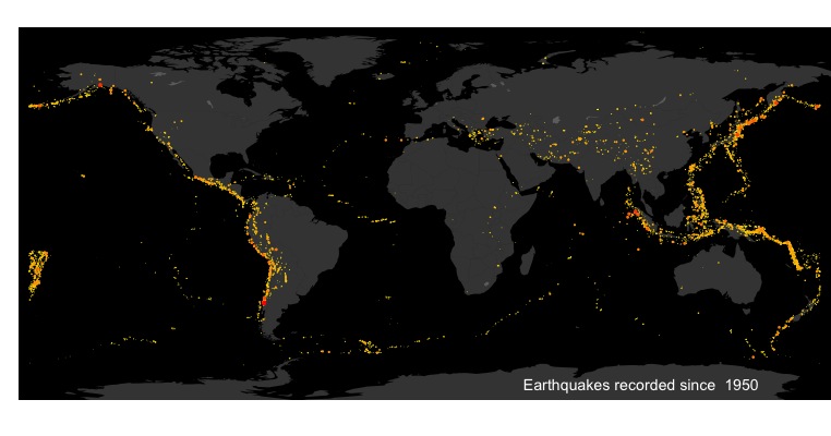
Now we can create a global earthquake map, with earthquake magnitude highlighted with color and size of the points.
# Plot world map with dots for earthquakes. The size of the dots and their color are according to magnitude of earthquake
ggplot()+
  geom_polygon(data = world.map, aes(x = long, y = lat, group = group),fill = "white",alpha=0.2)+
  theme_classic()+
  theme(axis.line = element_blank(), axis.text = element_blank(),axis.ticks = element_blank(),plot.margin=unit(c(3, 0, 0, 0),"mm"),legend.text = element_text(size = 6),legend.title = element_text(size = 8, face = "plain"),panel.background = element_rect(fill='black'))+ #sets the theme. Background color is black so the world map now appears (white on the black background).
  geom_point(aes(x=longitude,y=latitude,size=mag, color=mag),data=mycatalog)+ #Adds the earthquake points, with the size and color according to "mag" variable (magnitude).
  coord_fixed(ylim = c(-82.5, 87.5), xlim = c(-185, 185))+
  scale_size_continuous(range = c(0.25, 2))+ #size gradient for points
  scale_color_continuous(low="yellow",high="red")+ #color gradient for points
  theme(legend.position="none",axis.title.y=element_blank(),axis.title.x=element_blank())+
  geom_text(aes(x=35,y=-75),label=paste("Earthquakes recorded since ",EQ_min_year),color="white",hjust=0,size=3.5)
Now the hurricane track data set:
#Load historical hurricane data. Data was obtained from NOAA website: https://www.ncdc.noaa.gov/ibtracs/index.php?name=ibtracs-data

hurcat_all <- read.csv("Allstorms.ibtracs_wmo.v03r05.csv",header=T,stringsAsFactors=F)

#Selects only hurricanes since 1950
hur_min_year<-1950
hurcat <- hurcat_all[which(hurcat_all$Year >hur_min_year),]
Here I had an issue that the hurricanes that go from longitude 180 to -180 (New Zealand side of a flat map to Alaska side) create straight lines across the map. I could have split up those tracks into separate segments on each side of the flat map, but instead opted to remove them. This is just for visualization, and there were few such cases so it was simpler this way. The following code just removes all tracks that extend more than 200 degrees longitude.
#this function is used to remove hurricane tracks going from lon 90 to -90, which draw straight line paths accross the plot. It's not a elegant, but I only want a visualization.
checklon=function(Lon_array){
  myrange=max(Lon_array)-min(Lon_array)
  return(myrange<200)
}

temp<-aggregate(Lon~ID,data=hurcat,FUN=checklon)
hurcat_lon=temp$ID[which(temp$Lon)]
hurcat_dat<-hurcat[hurcat$ID %in% hurcat_lon,]
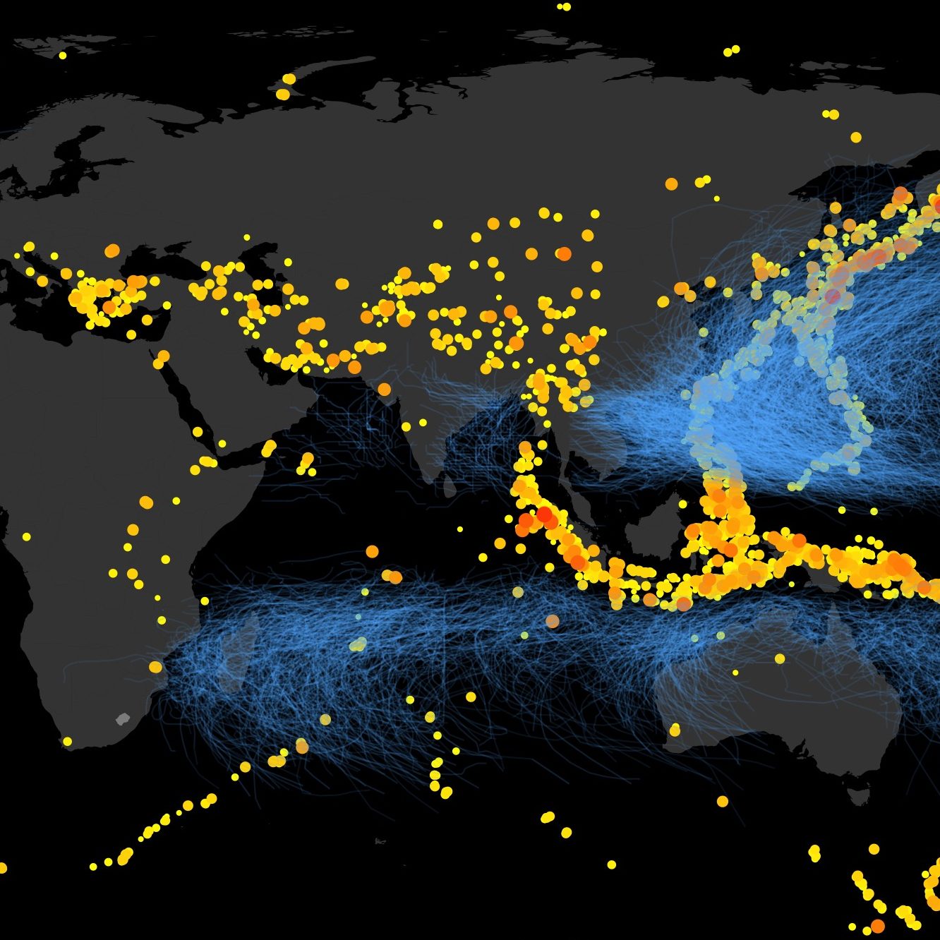
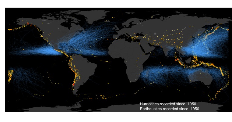
Now we can plot both earthquake and hurricane tracks on the same map. I’m colorblind, so not sure if the colors are well coordinated, but I tried!
ggplot()+
  geom_polygon(data = world.map, aes(x = long, y = lat, group = group),fill = "white",alpha=0.2)+
  theme_classic()+
  theme(axis.line = element_blank(),axis.text = element_blank(),axis.ticks = element_blank(),plot.margin=unit(c(3, 0, 0, 0),"mm"),legend.text = element_text(size = 6),legend.title = element_text(size = 8, face = "plain"),panel.background = element_rect(fill='black'))+
  geom_point(aes(x=longitude,y=latitude,size=mag, color=mag),data=mycatalog)+ #Adds the earthquake points, with the size and color according to "mag" variable (magnitude).
  coord_fixed(ylim = c(-82.5, 87.5), xlim = c(-185, 185))+
  scale_size_continuous(range = c(0.25, 2))+ #size gradient for points
  scale_color_continuous(low="yellow",high="red")+ #color gradient for points
  theme(legend.position="none",axis.title.y=element_blank(),axis.title.x=element_blank())+
  geom_path(data=hurcat_dat, aes(x=Lon, y=Lat, group=ID, alpha=Wind), color="steelblue1", size=0.25)+
  scale_alpha_continuous(range = c(0.1, 0.3))+ #Adds the hurricane, with the transparancy propotional to wind speed.
  geom_text(aes(x=35,y=-77),label=paste("Earthquakes recorded since ",EQ_min_year),color="white",hjust=0, size=3.5)+
  geom_text(aes(x=35,y=-69),label=paste("Hurricanes recorded since ",hur_min_year),color="white",hjust=0, size=3.5) #Add text
Leave a Reply